Definitions
For this use case we can define three roles:
- Data Owner - A person who controls a dataset and uses Differential Privacy (DP) to set a privacy limit that determines how much can be revealed about it.
- Data Scientist - A researcher who queries that dataset within the privacy limit using what’s called a privacy budget.
- Data Subject - An individual or entity represented by one or more data points within the dataset.
- Domain Node - A node (server) that houses the datasets being queried against.
Problem
Privacy-Enhancing Technologies (PETs) can protect data dynamically and contextually — but they’re often inaccessible to those without deep technical training. While working with OpenMined during our Early Access initiative, my team observed that static course materials could help overall Differential Privacy understanding but did not build confidence within non-technical users on utilizing Differential Privacy for their own data and use cases. What we realized was that in order to promote PETs literacy we should incorporate learning spaces that encourage simulation and play.
Approach
Collaborating with privacy researchers and data scientists, I led the design of an interactive Differential Privacy Dashboard that helps Data Owners simulate and see the trade-offs between data accuracy and privacy risk.
Differential Privacy works by applying a random amount of noise — within set limits — to a data result so that no individual’s contribution within the dataset can be singled out. The trade-off is that the more privacy you add the less accurate the result becomes. This balance can be difficult to grasp for two reasons:
- The randomness applied means that the same question can produce slightly different answers each time.
- The measure of privacy is not based on whether the question seems inherently intrusive or not; it is measured based on the individual’s within the dataset and how much their data points stand out.
For example, imagine analyzing the average income in a small town. If someone with an unusually high income (say, a billionaire) lives there, their data could skew the result and reveal more than intended about that one individual. Differential Privacy protects against this by adding more noise to hide that individual’s contribution.
To ground our work, we got permission to build off of Northwestern University’s ViP project, which already offered an elegant solution for visualizing DP’s randomness. Our contribution was to take the concept further and ask:
How might we help data owners understand the impact each data subject has on privacy risk — and how that risk changes as the dataset is used over time?
Outcomes
Using PySyft 0.7’s capabilities to manage privacy limits per Data Scientist and per domain node, we designed a prototype that helped Data Owners explore:
- How data accuracy shifts as privacy protection increases
- How individual contributions to data, influence the accuracy-privacy trade-off
- How these dynamics might unfold across multiple analyses made on the same dataset
Drawing inspiration from our co-mapping sessions with Dementias Platform UK (see case study), we mocked up how this tool would apply to a data consortia use case. The resulting prototype, turned abstract privacy concepts into a tangible experience that could help Data Owners build a sense of confidence and agency before making release decisions about their data.
This work informed an international trade pilot with the UN PET Lab (2023 UN PET Guide) and an algorithmic transparency pilot with Twitter.
Interface Breakdown
01 Project Request and Review
In our data consortia scenario, a Data Scientist begins by exploring a dataset description and dictionary defined by the Data Owner. Using that information along with provided mock data they submit a project request which contains: (1) a jupyter notebook housing their queries (2) a written explanation concerning their research aim and methods (3) profile information that details their affiliated org and role.
When the Data Owner reviews a project request they first land on the Details tab (See Figure 1.0). Within this view, they can explore:
- Project Context: The Data Scientist’s written explanation, affiliated organization and type (e.g. academic, NGO, private), and which data assets from the Domain Node are being queried.
- Submitted Notebook: A Jupyter Notebook including the code itself and any comments left within by the Data Scientist.
If the project doesn’t align with the organization’s values or poses a security breach, the Data Owner can decline the request directly from the Decision Area. Otherwise, they can continue to the Queries Tab to begin assessing privacy risk.
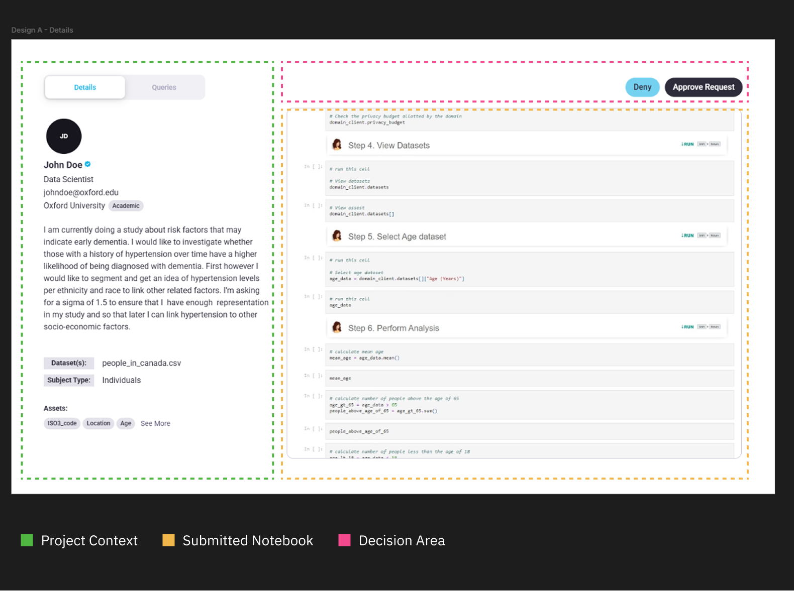
Figure 1.0 | Details tab layout breakdown
02 Queries Tab Overview
In the Queries Tab, the screen is divided into two main areas (see Figure 2):
- Controls (left): where the Data Owner sets a privacy limit for the Data Scientist.
- Query Visualization (right): where each query from the project is represented as a module showing its accuracy and risk trade-offs.
The key control is the Max User Limit— the overall privacy limit assigned to the Data Scientist. Adjusting this value dynamically updates every module and visualization. Below it, epsilon sliders display the privacy “spend” for each individual query—demonstrating that queries vary within their privacy spends and that a “Max Limit” acts as a ceiling.
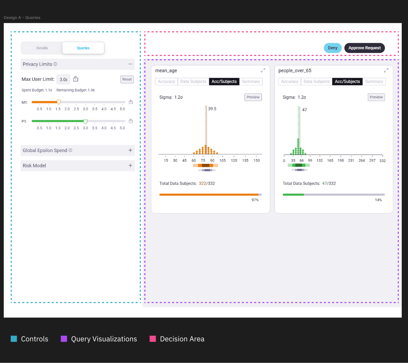
Figure 2.0 | Queries tab layout breakdown
03 Query Visualization Modules
Each query module offers four quick views— Accuracy, Data Subjects, Acc/Subjects, and Summary— to help the Data Owner compare how different queries behave under the chosen privacy limit (see Figure 3).
- Accuracy: shows how random noise applied by DP affects the accuracy of the answer. Using quantile dot plots to visualize the true answer against the range of possible answers the DP mechanism might produce.
- Data Subjects: uses a histogram to highlight how many data subjects get dropped from a computation for privacy protection.
- Acc/Subjects: Combines the Accuracy and Data Subjects views for quick comparisons.
- Summary: translates risk and accuracy into plain language, describing how the current privacy limit produces a range of answers within a percentage of risk.
These compact views allow quick comparisons across multiple queries and help the Data Owner grasp how the privacy limit set affects trade-offs across the entire submitted project.
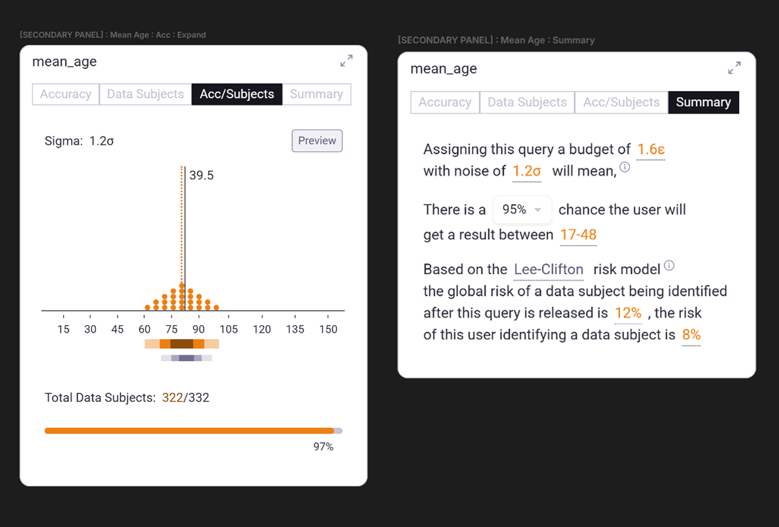
Figure 3.0 | Compact views for the submitted query "mean_age"
04 Expanded Query Views
To investigate a specific query, the Data Owner can click the expand icon (↗) in the top-right corner of a module. This helps the Data Owner transition from a top-level comparison mode to a detailed interrogation mode of review.
Accuracy View
This view (see Figure 4) incorporates the quantile dot plot concept from the ViP project, showing how differential privacy introduces randomness to the noise it applies on a result.
- The solid black line marks the true value of the query (e.g. 39.5).
- The dotted orange line shows the adjusted value after data subjects are removed (e.g. 38.4).
- The dot distribution visualizes the range of possible results under the current privacy setting.
Below, a flow line chart maps the spectrum between privacy and accuracy, helping reveal where gains plateau once certain data subjects are excluded.
To the right, annotations list key metrics— true value, adjusted value, number of data points used, percentage dropped. Tooltips within the chart reinforce these relationships.
At the bottom, the original query snippet and the Data Scientist’s “reason” for running it are displayed for context. These values were captured via PySyft’s Data Request method upon project submission.
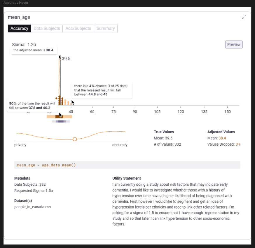
Figure 4.0 | Expanded "Accuracy" view of the query "mean_age"
Data Subjects View
In the Data Subjects view (see Figure 5), a histogram groups participants by their estimated privacy spend.
- A solid horizontal line marks the current Max User Limit.
- A dashed horizontal line indicates the Data Scientist’s previous limit (if they’ve submitted past projects).
- Active vs. inactive colorization shows which clusters are included or excluded under the current privacy setting.
This helps the Data Owner visualize the make up of data subjects within the dataset and how they affect the differential privacy algorithm.
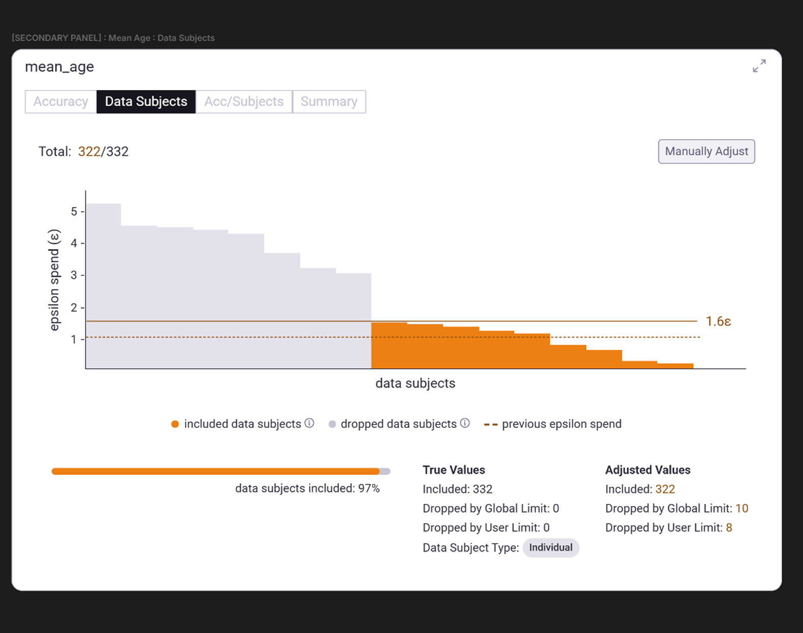
Figure 5.0 | Expanded "Data Subjects" view of the query "mean_age"
05 Global Controls and Risk Models
Through early user-testing, we found that terms like privacy budget or spend were confusing—suggesting users could “recharge” their privacy. Reframing the concept as a privacy limit with a max ceiling throughout the dashboard helped users better understand its cumulative, irreversible nature.
To reinforce this cumulative concept we created two more sections in the Controls area: the Global Epsilon and Risk Model sections (see Figure 6).
Global Epsilon Spend
This chart shows how privacy exposure accumulates across all Data Scientists working on the same Domain Node (see Definitions). It reuses the data subject histogram chart, simulating cumulative exposure over time.
If a privacy expert is available, a Global Limit can be enabled—capping how high any individual Data Owner on the node can set a Max User Limit. This ensures that overall privacy risk remains within acceptable bounds across an organization.
Risk Model
To make privacy risk more intuitive, we re-incorporated Lee-Clifton’s Risk Model (as used by the ViP project), which maps the privacy parameter epsilon to a percentage of disclosure risk.
The model assumes that any information released about an individual can be discovered by others in the system. It plots:
- X-axis: epsilon value (privacy limit)
- Y-axis: projected disclosure risk (percentage)
Using an outlined and filled dot to delineate, this view compares disclosure risk across both the individual Data Scientist’s privacy limit and the overall limit of others who have learned from these data subjects across the Domain Node.
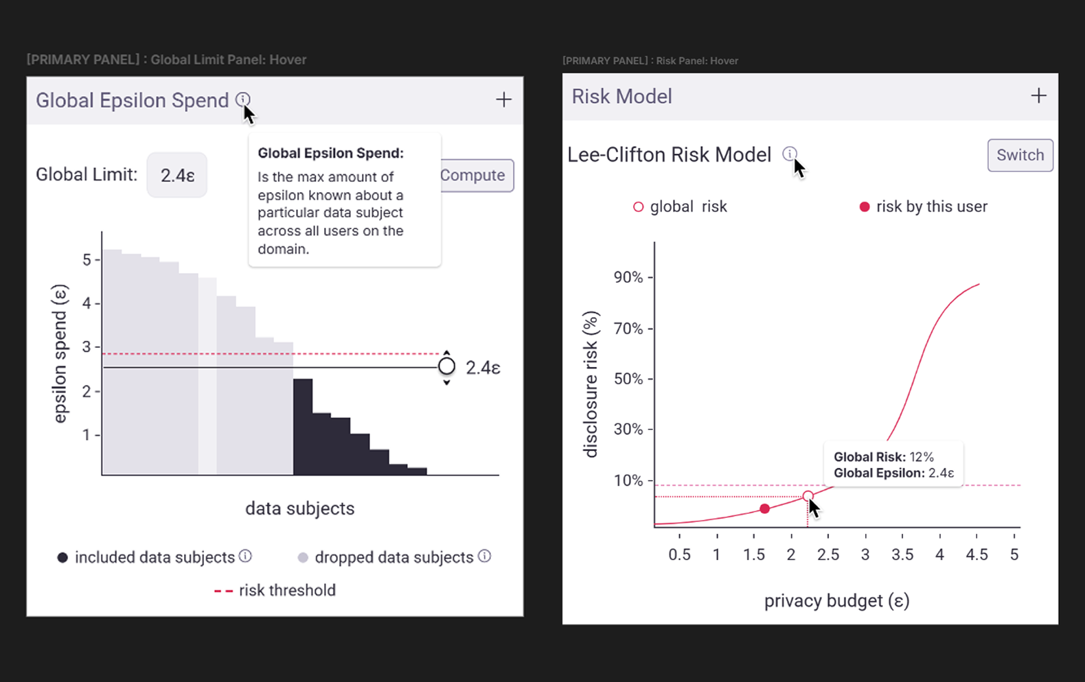
Figure 6.0 | Controls area: Global Epsilon and Risk Model sections
Final Thoughts
A picture is worth a thousand words.
An interface opens the door to a thousand experiences. This dashboard demonstrated how complex privacy concepts could be made accessible through thoughtful interaction design. By transforming parameters like epsilon and sigma into tangible, repeatable experiences, we demonstrated how a sandbox approach to interface could bridge the gap between technical privacy and human understanding. I hope that this work along with work like the ViP project continue to expand the application of PETs and more specifically serve as precedents we can build off of in the spaces of PETs literacy and algorithmic literacy. Where agency is key to ethical use, but technical know-how blocks access.